Tab Bar Accessory
Building a tab bar with an accessory view got a lot easier in iOS 26.0. SwiftUI added some new APIs dedicated to creating accessories that sit above the tab bar and customizing its behavior. We’ll go over how to build a dynamic tab bar accessory like this in your own apps.
Create the tabs
We’ll start by defining our tabs in a new view named TabBarView:
import SwiftUI

struct TabBarView: View {
    @State private var tab: AppTab = .accounts

    var body: some View {
        TabView(selection: $tab) {
            Tab("Accounts", systemImage: "person.fill", value: .accounts) {
                EmptyView()
            }

            Tab("Inbox", systemImage: "tray.fill", value: .inbox) {
                EmptyView()
            }

            Tab("Settings", systemImage: "gear", value: .settings) {
                EmptyView()
            }

            Tab(value: .search, role: .search) {
                EmptyView()
            }
        }
    }

    private enum AppTab {
        case accounts
        case inbox
        case settings
        case search
    }
}
For now, each tab will use an empty view. We’re also keeping track of the currently selected tab using the tab state property. This enables us to show or hide the tab bar accessory depending on which tab is currently selected.
It’s worth calling out that the .tabItem API has been replaced with Tab in newer iOS versions, for those who have built tabs in SwiftUI in the past. The Tab symbol was added in iOS 18.0, and .tabItem appears to have been deprecated in iOS 26.2.
Creating the accessory view
Next we’ll create a new accessory view for the Account tab named AccountTabAccessoryView:
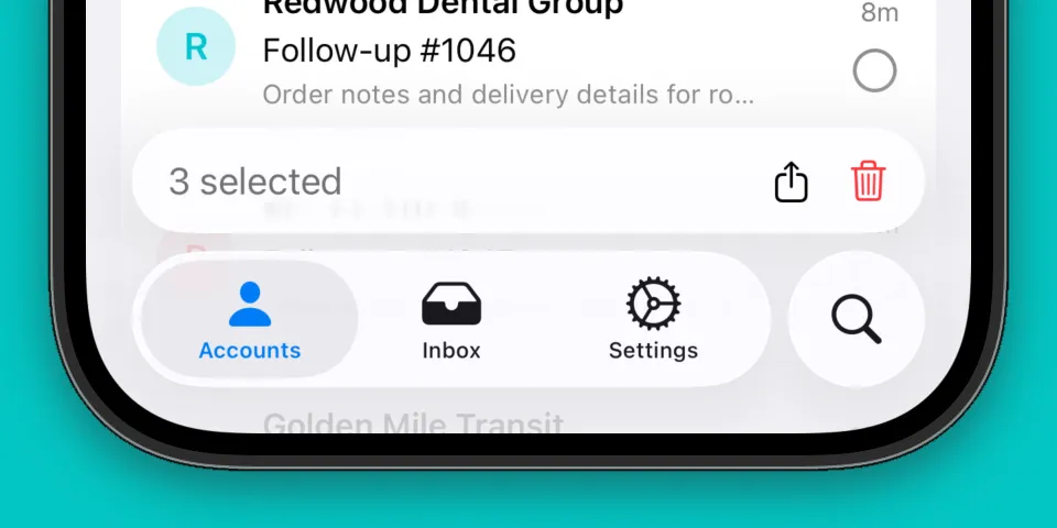
struct AccountTabAccessoryView: View {

    let selectionCount: Int

    var body: some View {
        HStack {
            Text("\(selectionCount) selected")
                .foregroundStyle(.secondary)

            Spacer()

            HStack(spacing: 16) {
                Button {
                    // Share action
                    print("Share button tapped")
                } label: {
                    Image(systemName: "square.and.arrow.up")
                }
                .buttonStyle(.plain)

                Button {
                    // Delete action
                    print("Delete button tapped")
                } label: {
                    Image(systemName: "trash")
                        .foregroundStyle(.red)
                }
                .buttonStyle(.plain)
            }
            .disabled(selectionCount == 0) // Disable the buttons if no items are selected
        }
        .padding()
    }
}
This view displays the number of selected items based on the selectionCount property that we pass in, and also two buttons for sharing and deleting the selected items. We also mark the buttons as disabled when there aren’t any items by applying .disabled(selectionCount == 0) to the HStack that contains them.
Displaying the accessory view
Back in our TabBarView, we can add .tabViewBottomAccessory(isEnabled: tab == .accounts) so the accessory is only displayed when we’re on the accounts tab. We’ll also display our accessory view with selection count set to 0 for now:
var body: some View {
    TabView(selection: $tab) {
        // Tabs
    }
    .tabViewBottomAccessory(isEnabled: tab == .accounts) {
        AccountTabAccessoryView(selectionCount: 0)
    }
}
The tabViewBottomAccessory modifier was introduced in iOS 26.0 and the isEnabled variant is new with iOS 26.1. Next, let’s add a stepper to help visualize changing the number of selected items:
struct TabBarView: View {
    @State private var tab: AppTab = .accounts

    // [1]
    @State private var count: Int = 0

    var body: some View {
        TabView(selection: $tab) {
            Tab("Accounts", systemImage: "person.fill", value: .accounts) {
                // [2]
                Text("Adjust count")
                    .fontWeight(.semibold)

                Stepper("", value: $count)
                    .labelsHidden()
            }

            // Other tabs...
        }
        .tabViewBottomAccessory(isEnabled: tab == .accounts) {
            // [3]
            AccountTabAccessoryView(selectionCount: count)
        }
    }

    private enum AppTab {
        case accounts
        case inbox
        case settings
        case search
    }
}
We added a few things to our view:
- [1] New state property to keep track of
count - [2] Add a
Stepperto increase or decrease thecount - [3] Pass
countto our accessory view
Now we can see our tab bar accessory update as we change the count.
Minimize the tab bar on scroll
Apps like Apple Podcasts have a pleasant animation where the tab bar minimizes when you scroll down, and the accessory bar moves to fill in the space. We can get the same behavior in our tab bar by specifying a tabBarMinimizeBehavior on our TabView:
var body: some View {
    TabView(selection: $tab) {
        // Tabs...
    }
    .tabViewBottomAccessory(isEnabled: tab == .accounts) {
        AccountTabAccessoryView(selectionCount: count)
    }
    .tabBarMinimizeBehavior(.onScrollDown)
}
The tab bar accessory will now tuck away at the bottom of the screen when you begin scrolling down in a list of content.
Wrapping up
Tab bars in SwiftUI have received a lot of improvements over the last few iOS releases. You can now use the Tab API to create tabs inside of a TabView, instead of .tabItem. You can also create accessories for tabs using the tabViewBottomAccessory API that was added in iOS 26.0.
This was a fun area to explore and I hope this short guide helps you build nice tab bar accessory views in your app!