Liquid Glass Toast
Elevate your iOS app from functional to unforgettable with a beautiful Liquid Glass toast that your users will love.
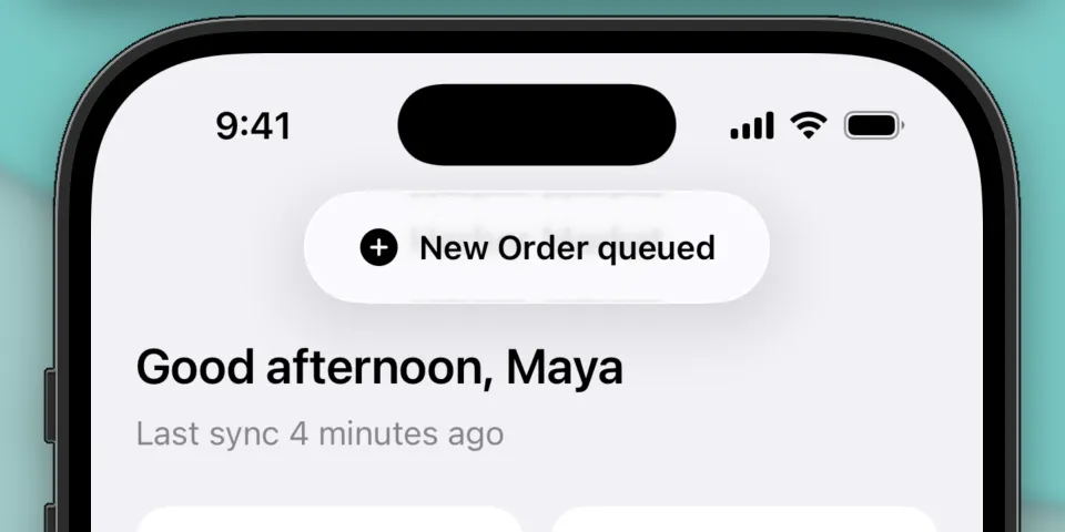
Toasts are a way to provide feedback to users in a non-intrusive way. They can be used to display an incoming notification, feedback, or an error message. They’re ephemeral, so they typically disappear after a few seconds and usually don’t require direct input from the user.
Let’s build a beautiful Liquid Glass toast using SwiftUI. We’ll create a new view modifier you can call from your app, similar to the sheet(isPresented:onDismiss:content:) API that SwiftUI exposes today:
VStack {
  // view
}
.toast(isPresented: $isPresented, configuration: configuration)
Creating the view modifier
The toast logic will live in a view modifier. Let’s define a new struct ToastPresenter:
struct ToastPresenter: ViewModifier {
    func body(content: Content) -> some View {
    }
}
We’ll define the properties next. We will use a binding to control whether the toast is currently presented or not, and other properties to control the content of the toast.
struct ToastPresenter: ViewModifier {

    @Binding var isPresented: Bool

    let duration: TimeInterval
    let systemImageName: String?
    let message: String
    let tint: Color?

    func body(content: Content) -> some View {
    }
}
These properties will control the duration the toast is displayed for, the image and message that will be displayed, and an optional background tint for the toast.
Building the toast
We’ll start by defining the lifecycle of the toast:
func body(content: Content) -> some View {
    content
        .overlay(alignment: .top) {
            // Coming soon
        }
        .animation(.default, value: isPresented)
        .task(id: isPresented) {
            guard isPresented else { return }
            try? await Task.sleep(for: .seconds(duration))
            isPresented = false
        }
}
We’ll use an overlay on top of the content to display the toast. The .animation(.default, value: isPresented) modifier applies an animation to our toast when isPresented changes values. The .task(id: isPresented) modifier is responsible for dismissing the toast. It runs whenever isPresented changes values, and will set isPresented = false after the specified number of seconds.
We can now focus on building the content of the toast. We’ll add the following to our .overlay(alignment: .top) modifier:
.overlay(alignment: .top) {
    if isPresented {
        HStack {
            if let systemImageName {
                Image(systemName: systemImageName)
                    .foregroundStyle(tint != nil ? .white : Color(uiColor: .label))
            }

            Text(message)
                .font(.subheadline.weight(.semibold))
                .foregroundStyle(tint != nil ? .white : Color(uiColor: .label))
        }
        .padding(.horizontal, 24)
        .padding(.vertical)
        .glassEffect(.regular.tint(tint))
        .transition(.move(edge: .top).combined(with: .opacity))
    }
}
We’ll first make sure our toast’s content is only displayed if isPresented is true. Next, we’ll build the content horizontally using an HStack. We’ll optionally display a system symbol image, and we’ll display the message adjacent to it. There’s also padding applied to the HStack to give the content more breathing room.
The .transition(.move(edge: .top).combined(with: .opacity)) modifier instructs the toast to animate in from the top edge when it appears and disappears, combined with an opacity animation to make it look like it’s fading in.
The Liquid Glass effect is applied using the .glassEffect(.regular.tint(tint)) modifier. .glassEffect(_:) takes a Glass struct to define what kind of glass effect we want to display. We’ll use the .regular variant which has higher opacity, which makes our toast’s content easier to read when overlaid arbitrary content.
There is also an optional .tint(tint) applied to the Glass, which fills the toast’s background with a Liquid Glass variant of the specified Color. This parameter is optional though, and doesn’t apply a color when tint is nil.
Notably, we also apply a .foregroundStyle(_:) to the image and message content depending on the value of tint. When a tint is applied, such as Color.blue, the image and message will be drawn white so it’s legible against the toast’s background. When tint is nil, we’ll default to the system’s .label color. This makes sure the color of image and message adapts automatically based on the content around it.
That’s it for drawing the content of the toast! Not too bad, even to get the new Liquid Glass look.
Presenting the toast
Lastly we’ll expose .toast() as a convenience method you can call on a View directly
extension View {
    func toast(
        isPresented: Binding<Bool>,
        duration: TimeInterval = 3.0,
        systemImageName: String? = nil,
        message: String,
        tint: Color? = nil
    ) -> some View {
        modifier(
            ToastPresenter(
                isPresented: isPresented,
                duration: duration,
                systemImageName: systemImageName,
                message: message,
                tint: tint
            )
        )
    }
}
You can present the toast in your view with some simple state properties. This example presents the toast in response to a button press. The toast automatically dismisses after the default 3 second duration.
struct ToastViewDemo: View {

    @State private var isShowingToast = false
    @State private var toastSystemImage: String?
    @State private var toastMessage = ""
    @State private var toastTint: Color?

    var body: some View {
        VStack {
            Button("Show toast") {
                isShowingToast = true
                toastSystemImage = "hand.wave"
                toastMessage = "Hello, world!"
                toastTint = nil
            }
        }
        .frame(maxWidth: .infinity, maxHeight: .infinity)
        .toast(isPresented: $isShowingToast,
               systemImageName: toastSystemImage,
               message: toastMessage,
               tint: toastTint)
    }
}
Wrapping up
Toasts are useful for displaying information to users in a non-intrusive way. They’re great for signaling an incoming notification, response to a user action, or an error message. It’s easy to make them look good too using the new Liquid Glass APIs for SwiftUI.
I hope you found this helpful or learned something new! Please feel free to reach out if there’s any comments or questions.
For reference, you can find the full toast implementation to drop into your project below. Happy building!
import SwiftUI

struct ToastPresenter: ViewModifier {
    @Binding var isPresented: Bool

    let duration: TimeInterval
    let systemImageName: String?
    let message: String
    let tint: Color?

    func body(content: Content) -> some View {
        content
            .overlay(alignment: .top) {
                if isPresented {
                    HStack {
                        if let systemImageName {
                            Image(systemName: systemImageName)
                                .foregroundStyle(tint != nil ? .white : Color(uiColor: .label))
                        }

                        Text(message)
                            .font(.subheadline.weight(.semibold))
                            .foregroundStyle(tint != nil ? .white : Color(uiColor: .label))
                    }
                    .padding(.horizontal, 24)
                    .padding(.vertical)
                    .glassEffect(.regular.tint(tint))
                    .transition(.move(edge: .top).combined(with: .opacity))
                }
            }
            .animation(.default, value: isPresented)
            .task(id: isPresented) {
                guard isPresented else { return }
                try? await Task.sleep(for: .seconds(duration))
                isPresented = false
            }
    }
}

extension View {
    func toast(
        isPresented: Binding<Bool>,
        duration: TimeInterval = 3.0,
        systemImageName: String? = nil,
        message: String,
        tint: Color? = nil
    ) -> some View {
        modifier(
            ToastPresenter(
                isPresented: isPresented,
                duration: duration,
                systemImageName: systemImageName,
                message: message,
                tint: tint
            )
        )
    }
}