Filter Toggle Button
I was inspired by a post I saw on X this week and decided to try building a button that can toggle between different filtering states, similar to the filter button in the Mail app on iOS. The button acts as a toggle to filter a list, and can also display a sheet of filter options to select from.
We’ll go over how to build the toggle filter button as a reusable component, and also how to incorporate filtering logic in a view that shows a simple list of data.
Create the FilterToggleButton
Let’s start by creating an empty view named FilterToggleButton:
import SwiftUI

struct FilterToggleButton: View {
    var body: some View {
    }
}
Next, we’ll add a binding that controls whether filtering is enabled, a property named filteredByText which displays the currently selected filter options, and a button that toggles the filter state:
import SwiftUI

struct FilterToggleButton: View {

    @Binding var isFilterEnabled: Bool
    let filteredByText: String

    var body: some View {
        Toggle("Toggle Filter", systemImage: "line.3.horizontal.decrease", isOn: $isFilterEnabled.animation())
    }
}
We added .animation() so an animation is applied when $isFilterEnabled is toggled. This is what allows the button to gracefully expand and minimize between its toggle states.
When the filter is enabled, we want to show another button that displays the current filter options and opens the filter option sheet when tapped:
var body: some View {
    Toggle("Toggle Filter", systemImage: "line.3.horizontal.decrease", isOn: $isFilterEnabled.animation())

    if isFilterEnabled {
        Button {
            // We will present the sheet in an upcoming step...
            print("Open filter sheet")
        } label: {
            VStack(alignment: .leading, spacing: 0) {
                Text("Filtered by")
                    .font(.caption)
                    .fontWeight(.semibold)

                Text("\(filteredByText) \(Image(systemName: "chevron.down"))")
                    .foregroundStyle(.tint)
                    .font(.caption2)
                    .fontWeight(.medium)
            }
            .padding(.trailing, 4)
            .frame(maxWidth: 150)
        }
    }
}
The button displays text inside of a VStack. Some styling notes:
.padding(.trailing, 4)gives the button some more space, which will be helpful once it’s embedded in a toolbar.frame(maxWidth: 150)forces the text to truncate once multiple filters are selected
Displaying the filter toggle button
We can add the FilterToggleButton to a toolbar item group in the view you would like to consume the button in. Here’s a simple example:
import SwiftUI

struct FilteredListDemo: View {

    // [1]
    @State private var isFilterEnabled: Bool = false

    var body: some View {
        // [2]
        NavigationStack {
            List {
                Text("Hello, world")
            }
            .toolbar {
                // [3]
                ToolbarItemGroup(placement: .bottomBar) {
                    FilterToggleButton(isFilterEnabled: $isFilterEnabled, filteredByText: "Test")
                }

                ToolbarSpacer(placement: .bottomBar)
            }
        }
    }
}
A couple things to note:
- [1] We added a
@Statevariable to keep track of the filter state of our view - [2] We embedded the content in a
NavigationStack, otherwise the toolbar behavior won’t work as expected - [3] We put our
FilterToggleButtoninside of aToolbarItemGroupon the bottom bar, with a spacer that pushes it to the leading side.ToolbarItemGrouphandles expanding and minimizing nicely when the filter button is toggled. We’ll also hardcode a string forfilteredByTextfor now
Displaying a sheet for filter options
Now that we have a button for toggling the filter state, we’ll add a sheet for selecting filter options when the “Filter by” button is pressed. Back in our FilterToggleButton:
// [4]
struct FilterToggleButton<FilterOptions: View>: View {

    @Binding var isFilterEnabled: Bool
    let filteredByText: String

    // [5]
    @ViewBuilder let filterOptionsView: FilterOptions

    // [6]
    @State private var isShowingSheet: Bool = false

    var body: some View {
        // View...
    }
}- [4] We added the generic
FilterOptions: Viewtype, which will be the view used for selecting filter options - [5] Add a
@ViewBuilderthat stores theFilterOptionsview as a property - [6] We’ll also add a private
@Statevariable to control if the filter option sheet is being shown or not.
Let’s update our view’s body next:
var body: some View {
    Toggle("Toggle Filter", systemImage: "line.3.horizontal.decrease", isOn: $isFilterEnabled.animation())

    if isFilterEnabled {
        Button {
            // [7]
            isShowingSheet = true
        } label: {
            VStack(alignment: .leading, spacing: 0) {
                Text("Filtered by")
                    .font(.caption)
                    .fontWeight(.semibold)

                Text("\(filteredByText) \(Image(systemName: "chevron.down"))")
                    .foregroundStyle(.tint)
                    .font(.caption2)
                    .fontWeight(.medium)
            }
            .padding(.trailing, 4)
            .frame(maxWidth: 150)
        }
        .sheet(isPresented: $isShowingSheet) {
            // [8]
            filterOptionsView
        }
    }
}- [7] We’ve updated the button’s action to show the sheet when it’s pressed
- [8] We also attached a
.sheetwhich displays thefilterOptionsView
This completes our FilterToggleButton component! When the toggle is tapped, a second button appears which displays the currently selected filters and can be pressed to display the filter options sheet.
Putting it together
Now that we have our completed component, we can make some enhancements to our FilteredListDemo view:
struct FilteredListDemo: View {

    // [9]
    static let evenFilter: String = "Even"
    static let oddFilter: String = "Odd"

    // [10]
    @State private var numbers: [Int] = [1, 2, 3, 4, 5, 6]
    private var filteredNumbers: [Int] {
        guard isFilterEnabled else {
            return numbers
        }

        let includeEvenNumbers = selectedFilters.contains(FilteredListDemo.evenFilter)
        let includeOddNumbers = selectedFilters.contains(FilteredListDemo.oddFilter)

        return numbers.filter { number in
            let isEven = number.isMultiple(of: 2)
            return isEven ? includeEvenNumbers : includeOddNumbers
        }
    }

    @State private var isFilterEnabled: Bool = false

    // [11]
    @State private var selectedFilters: [String] = [FilteredListDemo.evenFilter]

    var body: some View {
        // View...
    }
}- [9] We’ll define some filter options that we can select between
- [10] We’ll also store a list of numbers as our data source, and the
filteredNumbersproperty which holds the filtering logic. The logic filters even or odd numbers depending on which filters are selected - [11]
selectedFiltersrepresents the filters that are selected. By default, we’ll start with theevenFilterselected
Next, let’s update the view’s body:
var body: some View {
    NavigationStack {
        // [12]
        List(filteredNumbers, id: \.self) { number in
            Text(String(number))
        }
        .toolbar {
            ToolbarItemGroup(placement: .bottomBar) {
                // [13]
                FilterToggleButton(isFilterEnabled: $isFilterEnabled, filteredByText: selectedFilters.joined(separator: ", ")) {
                    // Need a filter options view...
                }
            }

            ToolbarSpacer(placement: .bottomBar)
        }
    }
}- [12] We’re now displaying the list of
filteredNumbers - [13] We’ve updated
FilterToggleButtonwith our new parameters. Notice we’re joining the selected filters in thefilterdByTextparameter, this displays what filters are currently selected when the button is in its toggled state
We’re still missing one piece of the filter toggle button component, the view for selecting the filter options! Let’s build a simple view for selecting filter options:
struct NumberFilterOptions: View {

    @Binding var selectedFilters: [String]

    @Environment(\.dismiss) private var dismiss: DismissAction
    private let filterOptions: [String] = [FilteredListDemo.evenFilter, FilteredListDemo.oddFilter]

    var body: some View {
        NavigationStack {
            List(filterOptions, id: \.self) { filter in
                Button {
                    if selectedFilters.contains(filter) {
                        selectedFilters.removeAll { $0 == filter }
                    } else {
                        selectedFilters.append(filter)
                    }
                } label: {
                    HStack {
                        Text(filter)

                        Spacer()

                        if selectedFilters.contains(filter) {
                            Image(systemName: "checkmark")
                                .resizable()
                                .frame(width: 18, height: 18)
                                .foregroundStyle(.tint)
                        }
                    }
                    .padding(.horizontal)
                    .contentShape(Rectangle())
                }
                .buttonStyle(.plain)
            }
            .navigationTitle("Filters")
            .navigationBarTitleDisplayMode(.inline)
            .toolbar {
                ToolbarItem(placement: .primaryAction) {
                    Button("Dismiss", systemImage: "checkmark") {
                        dismiss()
                    }
                    .buttonStyle(.glassProminent)
                }
            }
        }
    }
}
The responsibility of this view is to display the even and odd filter options, and allow them to be selectable. We keep track of the currently selected ones in the selectedFilters binding. We also have a toolbar button that dismisses the sheet once we’re done selecting filters.
We can tie this back into our FilteredListDemo view by updating the toolbar item:
// View...
.toolbar {
    ToolbarItemGroup(placement: .bottomBar) {
        FilterToggleButton(isFilterEnabled: $isFilterEnabled, filteredByText: selectedFilters.joined(separator: ", ")) {
            NumberFilterOptions(selectedFilters: $selectedFilters)
        }
    }

    ToolbarSpacer(placement: .bottomBar)
}
Now our filtered list view is complete! When we run it, we see a list of numbers from 1 to 6. If we tap the filter toggle button, we’ll see the button expand into its filtered state. We’ll also see the list get filtered so only even numbers are remaining.
If we tap into the “Filtered by” button, we can see the filter options sheet is shown. We can update which filters are applied by selecting options from this list.
Use cases
FilteredListDemo is a simple application of this component, but its purpose is to offer complex filtering options in large lists of data. It could probably be expanded to support other list operations as well, such as sorting.
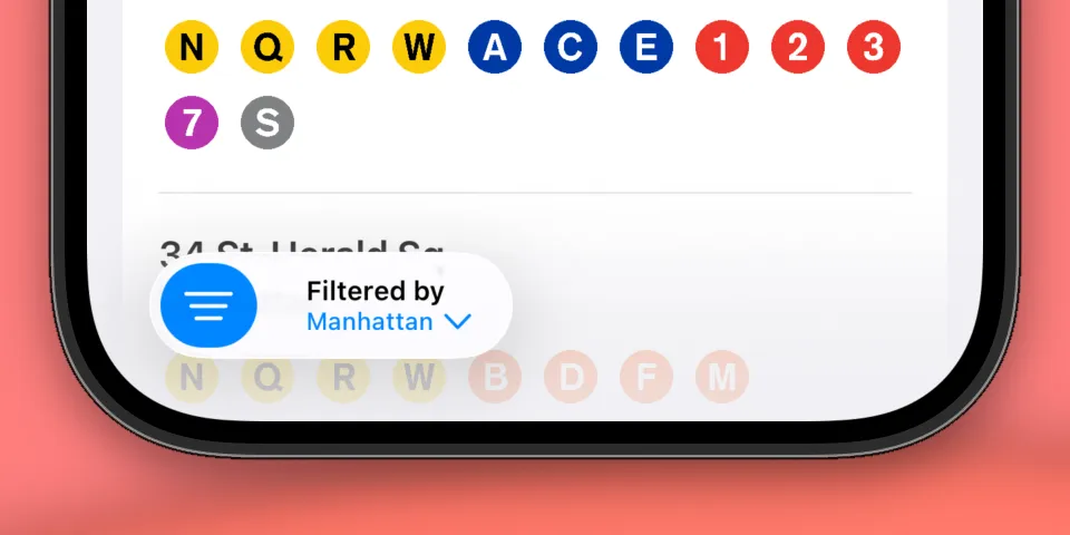
Here’s an example of the filter toggle applied to a large list of train stations in New York City, used to filter stations by their borough.
What’s next
This component brings us pretty close to the filter toggle button like in the iOS Mail app. If you’ve spent a lot of time tapping the filter toggle button in the Mail app like I have, you may have noticed the filter sheet the Mail app displays is different than what we’ve implemented. Indeed, the Mail app’s filter options sheet is not actually a regular SwiftUI sheet at all. It’s uses a custom animation that originates from the filter button itself, and uses a scaling animation as you drag it down. This seems to be a custom component and not available as a public API unfortunately. We could probably implement our own, but I’ll save that for another article!
Thank you for following along if you’ve made it this far! I hope the article was helpful or insightful, and be sure to check out the full component below:
import SwiftUI

struct FilterToggleButton<FilterOptions: View>: View {

    @Binding var isFilterEnabled: Bool
    let filteredByText: String
    @ViewBuilder let filterOptionsView: FilterOptions

    @State private var isShowingSheet: Bool = false

    var body: some View {
        Toggle("Toggle Filter", systemImage: "line.3.horizontal.decrease", isOn: $isFilterEnabled.animation())

        if isFilterEnabled {
            Button {
                isShowingSheet = true
            } label: {
                VStack(alignment: .leading, spacing: 0) {
                    Text("Filtered by")
                        .font(.caption)
                        .fontWeight(.semibold)

                    Text("\(filteredByText) \(Image(systemName: "chevron.down"))")
                        .foregroundStyle(.tint)
                        .font(.caption2)
                        .fontWeight(.medium)
                }
                .padding(.trailing, 4)
                .frame(maxWidth: 150)
            }
            .sheet(isPresented: $isShowingSheet) {
                filterOptionsView
            }
        }
    }
}